Thursday, December 20, 2007
Friday, December 14, 2007
Tuesday, December 4, 2007
Thursday, November 29, 2007
Tuesday, November 27, 2007
Friday, November 16, 2007
Thursday, November 8, 2007
principles and elements of design
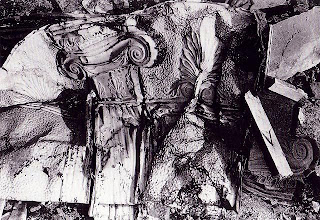 UNITY
UNITYthis picture represents unity by all the shapes fitting so well together
artist: Walker Evans
source www.masters-of-photography.com
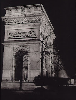 BALANCE
the four polls on the bottom are holding up the whole rest of arc up. Giving each thing a need making the arc a complete balanced thing.
artist Brassai (Gyula Hslssz)
source www.matsters-of-photography.com
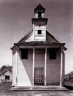 SYMMETRY
this house could be split in half with both sides being the same shape and size. making the house a thing of symmetry.
artist: Walker Evans
source www.masters-of-photography.com
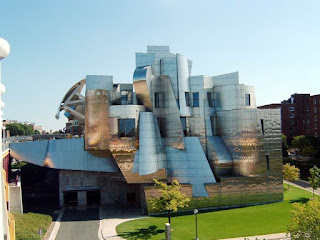 ASYMMETRY
his museum couldn't be split in half and have the same two sides but it does have symmetry, making it asymmetrical.
source
Whttp://en.wikipedia.org/wiki/weisman_art_museum.com
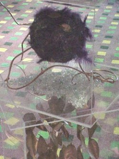 DOMINANCE
there is so much going on in this picture but what pops out is the big black ball making it dominate the picture and draw the eyes in.
source www.floralartmall.com
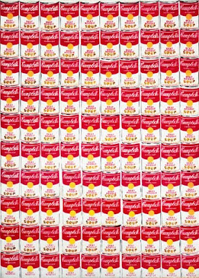
REPETITION
the soup cans are repeted over and over creating repetition of the same image.
artist: Andy Warhol
source http://www.albrightknox.org/artstar/art/warhol.jpg
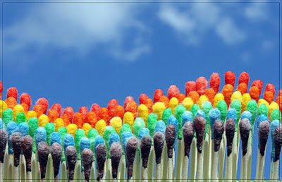
RHYTHM
this is a sense of rhythm because it has a regular repetition that shows a pattern of movement
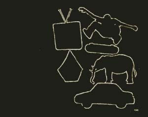 LINES
LINESthis picture represents lines by the direction they all go to make a shape. And all the widths are the same.
 CONTRAST
this picture is contrasting itself by the different colors coming together to form some difference between the top and the bottom
artist Emily Hoy
source http://www.volcom.com/art/VolcomArt/detail.asp?id=34
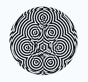
THEME/VARIATION
it represents theme and variation because it all sort of meshes together but its different in the middle.
artist Ryan Thomas
source http://www.volcom.com/art/VolcomArt/detail.asp?id=12
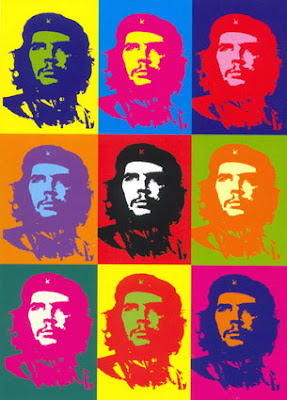 COLOR
COLORthis one is just pretty colorful it just jumps out at you. this photo uses complementary colors to form one whole picture with nine others in it.
artist Andy Warhol
source http://www.lancs.ac.uk/ug/fosterz/Matisse/Andy%20Warhol-CheGuevara.jpg
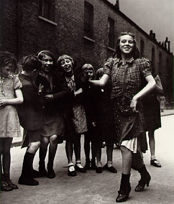 VALUE
VALUEthe black and white gives a good contrast of the tint and shade in the photo, it is not just black and white but has different shades of blacks and whites
artist Bill Brandt
source http://www.masters-of-photography.com/B/brandt/brandt_lambeth_walk_full.html
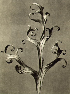 TEXTURE
this gives a feel of texture by the shadows in the picture on the plant. This is also Visual Texture because you can see it coming out but not necessarily feel it.
artist Karl Blossfeldt
source http://www.masters-of-photography.com/B/blossfeldt/blossfeldt_larkspur_full.html
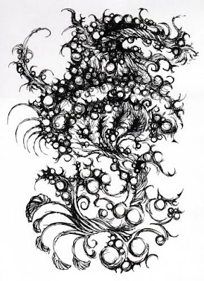 SHAPE/FORM
this shape is two dimensional and also and organic picture because it moves circular
source www.faex.com/
 SHAPE
SHAPEthis picture is a form of shape because it has space in between the birds with positive space in the back by the objects appearing in front.
artist MC Esher
source http://www.clas.ufl.edu/ipsa/journal/images/escher2.gif
Subscribe to:
Comments (Atom)


